Classifying Loans based on the risk of defaulting
A Short Introduction
Classification is one of the classical problems in Supervised Learning where we attempt to train a model to classify data points into n distinct classes. As I was browsing through datasets online, I came across one that contained information on 1000 loan applicants (from both urban and rural areas). One of the columns in the data table was whether or not the loan was approved. An idea immediately struck me:
What if we could build a model to predict whether an applicant’s loan would be approved or denied depending on his or her risk of defaulting?
This would be a garden-variety classification problem, where we have 2 distinct classes to group our data by: a loan approval or a loan denial.
It is important to not be hasty and start training models on the raw and unexplored data. Preprocessing the data not only helps us smooth out inconsistencies (missing values and outliers), but also gives us a comprehensive understanding of the data which in turn aids us in our model selection process.
This end-to-end Machine Learning project is primarily based on Python. I have used the following libraries to help me achieve the objective:
- Numpy for mathematical operations.
- Pandas for data exploration and analysis
- Matplotlib and Seaborn for data visualization
- Scikit-learn for model training, cross-validation, and evaluation metrics.
Importing the libraries
Let us perform all the necessary imports beforehand
import numpy as np
np.seterr(divide='ignore')
import math
import pandas as pd
from sklearn.linear_model import LogisticRegression
from sklearn.model_selection import train_test_split
from sklearn.preprocessing import OneHotEncoder
from sklearn import metrics
import matplotlib.pyplot as plt
import seaborn as sns
Once we have all the libraries necessary, we can read the data in from CSV file using Pandas.
data = pd.read_csv('credit_risk.csv')Understanding the Features
Before moving forward with the data exploration, I always like to understand the features that I will be dealing with on a superficial level. Doing this will help us put into words any mathematical interpretations we make. The following are the list of features that we have from our dataset:
- Loan ID: The ID given by the bank to the loan request.
- Gender: The gender of the primary applicant.
- Married: Binary variable indicating the marital status of the primary applicant.
- Dependents: Number of dependents of the primary applicant.
- Education: Binary variable indicating whether or not the primary applicant has graduated high school.
- Self_Employed: Binary variable indicating whether or not the individual is self-employed.
- Applicant Income: The income of the primary applicant.
- Co-Applicant Income: The income of the co-applicant.
- Loan Amount: The amount the applicant wants to borrow.
- Loan Amount Term: The term over which the applicant would repay the loan.
- Credit History: Binary variable representing whether the client had a good history or a bad history.
- Property Area: Categorical variable indicating whether the applicant was from an urban, semiurban, or a rural area.
- Loan Status: Variable indicating whether the loan was approved or denied. This will be our output (dependent) variable.
Of all these variables, I have chosen the Gender, Applicant Income, Loan Amount, and Property Area as the ones to delve deeper into. It is important to look at the data from multiple angles, i.e., independently and in relation to the other variables. This points out any red flags in the dstributions of the variables and also reveals interesting relationships amongst them.
Visualizing the data
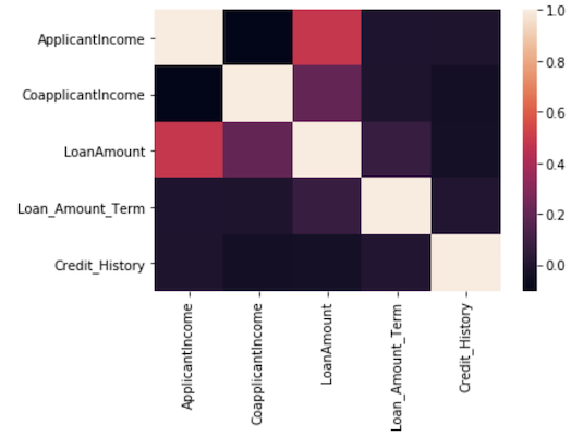
Humans are visual creatures, and a majority of us process information better when we see it. Thus, when it comes to understanding our data, taking a visual approach is far more effective than manually crunching hundreds of rows worth of numbers. I have plotted visualizations that show the distributions of important features as well as interesting relationships between some of the features. How did I decide which features are important? I used the correlation matrix, where the value at (i, j) represents how strongly feature i is correlated to feature j.
We can use seaborn’s heatmap visualization to help us understand the correlation matrix.
sns.heatmap(data.corr())Before we begin explorng our feature variables, I wanted to have a look at our dependent variable, i.e., the one we are attempting to predict using the model. Shown below is a simple countplot by class.
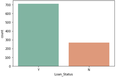
There is a clear imbalance between the classes, and that can be very dangerous! Our model may end up highly biased towards the majority class, which is not ideal when it comes to the model’s generalization capabilities. For that reason, we will perform feature scaling to ensure uniformity, and also make sure that the algorithm we use to build the model is ‘aware’ that the classes are imbalanced.
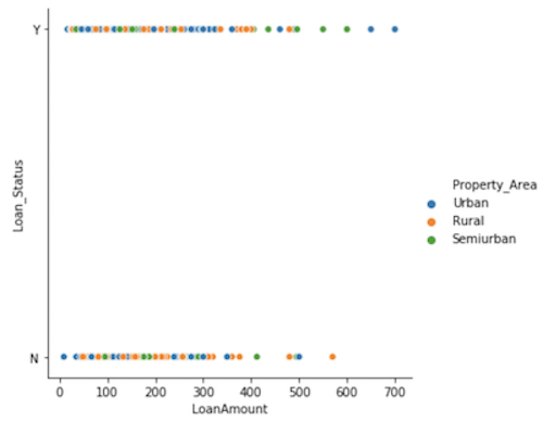
I was also curious about how the property area and the loan amount jointly affected the authorization of the loan. Let us have a look at a relational plot of the loan amount against approval separated by the property area.
It will help if we divide the data into approved and unapproved loans and look at the count of how many of those loan applications came from each property area.
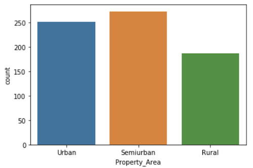
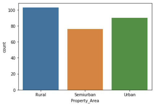
From the looks of it, it looks like a higher fraction of the rural loan applications are denied. I calculated the ratio of approved loans from each property area, and the numbers corroborate our hypothesis.
- Urban Approval Ratio: 0.7368421052631579
- Semiurban Approval Ratio: 0.7822349570200573
- Rural Approval Ratio: 0.6448275862068965
Cleaning the data
Now that we’ve explored the data visually to better understand what we’re dealing with, its time to preprocess our data in order to make sure that the model we train is not subject to any noisy training instances (in the context of ML, the term “training instance” refers to a single data point that is part of the dataset used to train and test the model.) I have divided our preprocessing step into the following substeps:
- Check for and replace missing values if necessary.
- Remove unncessary features.
- Encode categorical features to make sure they are properly interpreted.
# **Replace the categorical values with the numeric equivalents that we have above**
categoricalFeatures = ['Property_Area', 'Gender', 'Married', 'Dependents', 'Education', 'Self_Employed']

# **Iterate through the list of categorical features and one hot encode them.**
for feature in categoricalFeatures:
    onehot = pd.get_dummies(data[feature], prefix=feature)
    data = data.drop(feature, axis=1)
    data = data.join(onehot)
Note that data preprocessing is by no means formulaic, and the steps that I am about to take are subjective.
Training the model
Fin*ally, the exciting bit! We have our data prepared, and we shall serve it to our model to devour! The algorithm that I chose for this particular case was Logistic Regression. It is one of the simpler supervised learning algorithms, but has proven to be extremely reliant in a variety of instances.
Before we train the model, we shall utilize Scikit-learn’s inbuilt train-test split module to randomly split our dataset into training and testing subsets. We shall split it according to the 80-20 rule (this seems an arbitrary and scientifically ungrounded choice, but it is known to “just work” when it comes to training models).
Let us begin by instantiating a Logistic Regression object (we will be using scikit-learn’s module) and split the dataset in the aforementioned way.
# Liblinear is a solver that is effective for relatively smaller datasets.
lr = LogisticRegression(solver='liblinear', class_weight='balanced')
Notice that we specify that the weights of the classes in question have to be balanced. This ensures that the classes are appropriately weighted, thereby eliminating any bias created by an imbalance in the classes. If you are curious as to how the classes are weighted, this article by Chris Albon provides a comprehensive explanation.
Before we pass in the data, let us perform feature scaling using Scikit-learn’s Standard Scaler.
scaler = StandardScaler()
data_std = scaler.fit_transform(data)
# We will follow an 80-20 split pattern for our training and test data
X_train,X_test,y_train,y_test = train_test_split(data, y, test_size=0.2, random_state = 0)Now that we have everything we need, we fit the model to the training data.
lr.fit(X_train, y_train)Evaluating the performance of the model
It is just as (if not more) important to evaluate the performance of algorithms as it is understanding and implementing them. I’ve provided a brief but comprehensive introduction to the confusion matrix and the three fundamental evaluation metrics for classification.
A Confusion matrix is simply a tabular visualization of the error rates of the matrix that is widely used to evaluate the performance of a classification algorithm. The rows of the matrix represent the actual label of the instance, while the columns reprsent the predicted label. In our case, we have a 2x2 matrix as we are performing binary classification. To generalize, an “n-ary” classification problem will have an nxn confusion matrix.
The (m, n) entry of the confusion matrix tells us how many instances whose correct label is class m was classified into class n. So, the diagonal entries of our matrix represents correct classifications and the rest represent the incorrect ones. In binary classification, the diagonal entries are commonly referred to as the true positives and the true negatives, and the other two are the false positives and false negatives.
Now that the model has been trained, we will use the test data that we sieved from the original dataset to evaluate how well our model generalizes to the data. I have divided the evaluation process in the following way:
- Vectorize the predictions made by the model and build a confusion matrix.
- Use the confusion matrix
# We will compare this vector of predictions to the actual target vector to determine the model performance.
y_pred = lr.predict(X_test)

# Build the confusion matrix.
confusion_matrix = metrics.confusion_matrix(y_test, y_pred)
class_names=[0,1] # name of classes
fig, ax = plt.subplots()
tick_marks = np.arange(len(class_names))
plt.xticks(tick_marks, class_names)
plt.yticks(tick_marks, class_names)

# The heatmap requires that we pass in a dataframe as the argument
sns.heatmap(pd.DataFrame(confusion_matrix), annot=True, cmap="YlGnBu", fmt="g")

# Configure the heatmap parameters
ax.xaxis.set_label_position("top")
plt.tight_layout()
plt.title('Confusion matrix', y=1.1)
plt.ylabel('Actual label')
plt.xlabel('Predicted label')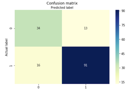
At a glance, most of our classifications seem to be concentrated in the diagonal entries. An excellent start! Recall that we said the matrix gave us the error rates. But, its hard to gain a concrete numerical measure of the model’s performance from the matrix alone. Thus, we use the values from the matrix to compute the three fundamental classification performance measures: accuracy, precision, and recall.
- Precision:
- Recall
- Accuracy
Scikit-learn’s inbuilt metrics module lets us compute these metrics in a single line of code!
# Print out our performance metrics
print("Accuracy:",metrics.accuracy_score(y_test, y_pred))
print("Precision:",metrics.precision_score(y_test, y_pred, pos_label='Y'))
print("Recall:",metrics.recall_score(y_test, y_pred, pos_label='Y'))
For our model, the metrics’ values turned out to be:
- Accuracy: 0.8116883116883117
- Precision: 0.875
- Recall: 0.8504672897196262
It is an accepted practice to use precision and recall in conjunction to gauge the performance of a classfication model as one could simply use instances that he or she knows would result in a correct prediction to gain a perfect precision score. In other words, if I have one training instance that I knew belonged to the positive class I would make sure that the model classifies only that instance into the positive class. The F1 score is a metric that is a harmonic sum of the precision and recall. It is a singular measure of a model’s performance and takes into account both the precision and recall, thus making sure that we do not have to go through the hassle of interpreting the numbers manually. Yet again, Scikit learn’s metrics module comes to the rescue!
print("F1 Score:",metrics.f1_score(y_test, y_pred, pos_label='Y'))F1 Score: 0.8625592417061612
Conclusion
Alright, awesome! We sucessfully trained a model that can predict the response to a loan applicant based on the data we have on them. To do this at scale would be futile for us humans, but the performance of the classifier shows us just how powerful these techniques can be. Classification is but one of the multitude of techniques available as part of the Predictive Modeling toolbox. I hope that this has proven to be an informative and engaging introduction to the topic. Happy coding!